2022
StudySmarter
Optimising the search and browse experience of Europe's largest learning platform.

Team
Product Team & Freddie Sukprasong
Role
Product Designer
Responsibilities
Research, Strategy, Concept, Interaction Design
The Process
Collect and streamline existing insights building archetypical user flows.
Generate a list of user problems and formulate key challenges.
Ideate concepts for each challenge & prioritise the solutions together with the PM.
Create first designs & refine them within my product team in collaboration with the content team.
The Outcome
This Article describes how we designed…
The browsing feature
that lets users tap through content without requiring them to type a search.
Search suggestions and autocomplete
to help formulate a search query that leads to valuable results.
Extended search capabilities
for users to search through every content hierarchy level we have – from subjects down to flashcards.
The implemented browse and search features proved to have a significant impact on the number of users ending up studying and the time they spent studying with the content they found through these features.
The Foundation (Research Synthesis)
First things first: From a range of research on what content people are looking for when studying and how they use StudySmarter’s search, we synthesised several archetypical user flows based on the user intentions we identified.

Nothing Specific in Mind
Just here to Browse and get to know our content. Maybe ending up studying something that feels relevant to them.
Specific Grade or School
Coming to the platform with the intention to study, without knowing what to study for (first). Possibly wanting to spot knowledge gaps, looking at what’s needed to perform well in their grade.
Specific Subject or Field
Coming to the platform with the intention to study for a specific subject. Likely wanting to spot knowledge gaps, looking at what’s needed to perform well in that subject (and their grade).
Specific Topic
Coming to the platform with the intention to study, having a topic (or a broad term) in mind, they’d like to study for. Possibly wanting to study everything in that specific topic, eventually identifying knowledge gaps and closing them.
Specific Question
Looking for the answer to a specific question, exercise or problem. Likely not being satisfied with answers to roughly similar questions.
These intentions may also change during the use of the app, while consuming or looking for content.
The Challenges
The most critical steps within these user flows were addressed by »How Might We…?«-notes asking for solutions that acknowledge these steps within our app.
Some key HMW-notes were:
HMW present the users with valuable content without requiring them to type to search? (Avoiding them typing random terms just to get results)
HMW guide people to valuable content even if they typed a search term that would not lead to results in study sets?
HMW enable people to search for (full) specific questions?
HMW cover users’ search intentions during content exploration, even if their intention switches within one session?
In addition to these, a variety of issues users were having with our app’s search were collected (more in the solutions below).
Solution Space 1 – Search Suggestions & Extended Capabilities

Search Suggestions & History
In order to help users formulate search queries that lead them to the most valuable content already while typing.
Search for Subjects
From our app tracking, we saw that many people, when typing a search query, they’d type the name of the school subjects, they were interested in. We therefor extended the search suggestions by shortcuts to subjects that matched the entered term. (see image above)

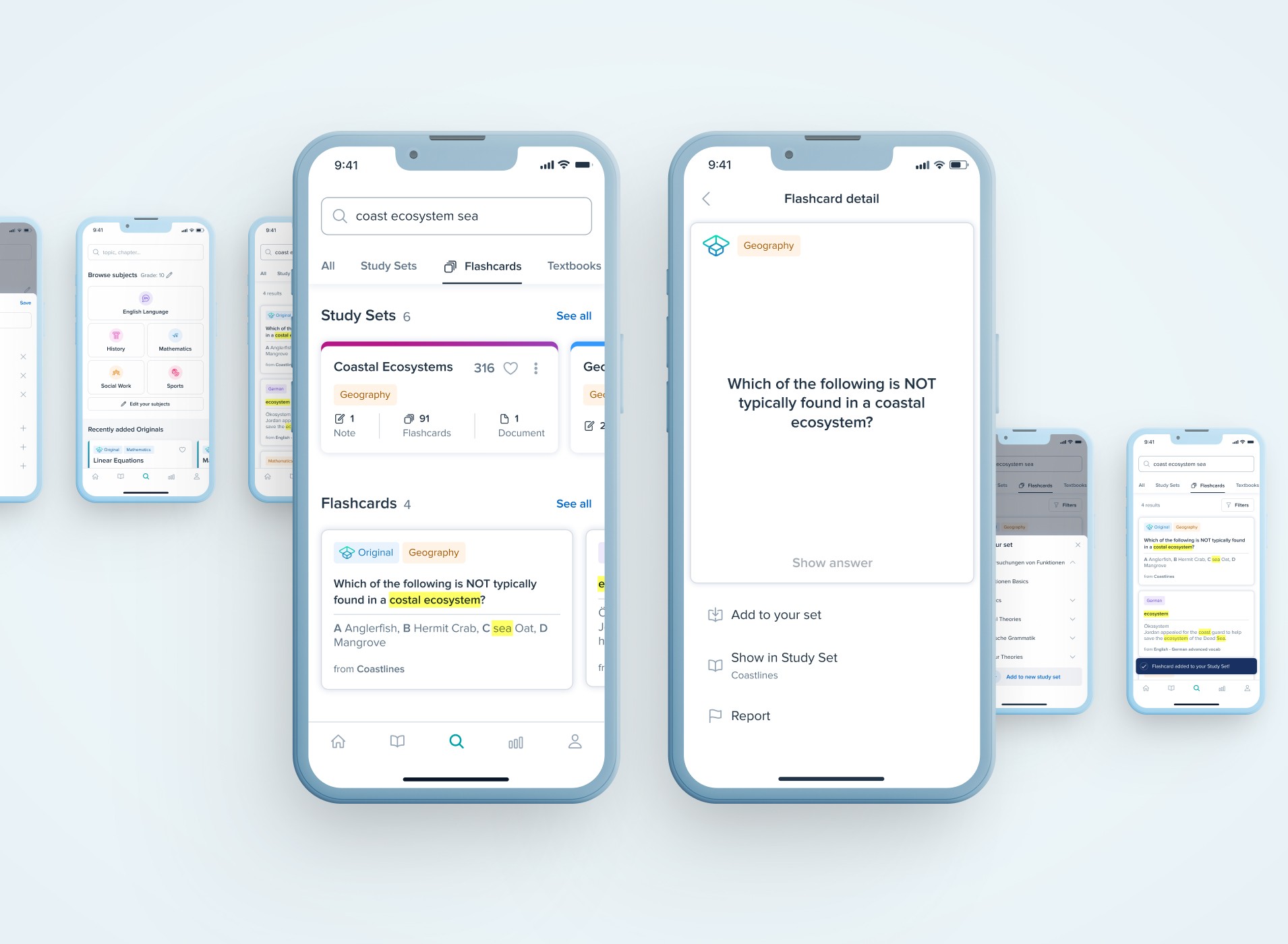
Search for Flashcards & Reuse them
HMW enable people to search for (full) specific questions? For users looking for answers to specific questions, we already offered text books to search and find solutions to exercises in. However these obviously could and did not cover that many topics. We therefor enriched the search capabilities by adding a flashcard search and including simple options to copy and reuse them.
Solution Space 2 – Browse
Further Preparation & Research
How might we present the users with valuable content without requiring them to type to search?
In order to answer this question, we needed to understand, how users perceive and make use of our current content structures and what structural models suit them best when they work with study materials in general.

The main insights of benchmarking competitors’ content structures and user generated content were:
Every student may have a different mental model and expectation for information structures in study materials.
Students’ school books give a hint about how a coherent study material structure may look like but differ from one publisher to another.
Small content groups have to be re-usable/referenced within several topics and subjects in order to create a scalable system.
After getting a grasp for the students’ mental models, a design vision was crafted that took our existing contents into account and several implementation and test packages were defined to go forward with.

A Search & Browse Home Screen
That provides users with different entry points for the different intentions they may have when deciding to look for content.
Subject Home Screens
That provide the users with more specific entry points for the different intentions they may have after deciding to study for a subject.
2022
StudySmarter
Optimising the search and browse experience of Europe's largest learning platform.

Team
Product Team & Freddie Sukprasong
Role
Product Designer
Responsibilities
Research, Strategy, Concept, Interaction Design
The Process
Collect and streamline existing insights building archetypical user flows.
Generate a list of user problems and formulate key challenges.
Ideate concepts for each challenge & prioritise the solutions together with the PM.
Create first designs & refine them within my product team in collaboration with the content team.
The Outcome
This Article describes how we designed…
The browsing feature
that lets users tap through content without requiring them to type a search.
Search suggestions and autocomplete
to help formulate a search query that leads to valuable results.
Extended search capabilities
for users to search through every content hierarchy level we have – from subjects down to flashcards.
The implemented browse and search features proved to have a significant impact on the number of users ending up studying and the time they spent studying with the content they found through these features.
The Foundation (Research Synthesis)
First things first: From a range of research on what content people are looking for when studying and how they use StudySmarter’s search, we synthesised several archetypical user flows based on the user intentions we identified.

Nothing Specific in Mind
Just here to Browse and get to know our content. Maybe ending up studying something that feels relevant to them.
Specific Grade or School
Coming to the platform with the intention to study, without knowing what to study for (first). Possibly wanting to spot knowledge gaps, looking at what’s needed to perform well in their grade.
Specific Subject or Field
Coming to the platform with the intention to study for a specific subject. Likely wanting to spot knowledge gaps, looking at what’s needed to perform well in that subject (and their grade).
Specific Topic
Coming to the platform with the intention to study, having a topic (or a broad term) in mind, they’d like to study for. Possibly wanting to study everything in that specific topic, eventually identifying knowledge gaps and closing them.
Specific Question
Looking for the answer to a specific question, exercise or problem. Likely not being satisfied with answers to roughly similar questions.
These intentions may also change during the use of the app, while consuming or looking for content.
The Challenges
The most critical steps within these user flows were addressed by »How Might We…?«-notes asking for solutions that acknowledge these steps within our app.
Some key HMW-notes were:
HMW present the users with valuable content without requiring them to type to search? (Avoiding them typing random terms just to get results)
HMW guide people to valuable content even if they typed a search term that would not lead to results in study sets?
HMW enable people to search for (full) specific questions?
HMW cover users’ search intentions during content exploration, even if their intention switches within one session?
In addition to these, a variety of issues users were having with our app’s search were collected (more in the solutions below).
Solution Space 1 – Search Suggestions & Extended Capabilities

Search Suggestions & History
In order to help users formulate search queries that lead them to the most valuable content already while typing.
Search for Subjects
From our app tracking, we saw that many people, when typing a search query, they’d type the name of the school subjects, they were interested in. We therefor extended the search suggestions by shortcuts to subjects that matched the entered term. (see image above)

Search for Flashcards & Reuse them
HMW enable people to search for (full) specific questions? For users looking for answers to specific questions, we already offered text books to search and find solutions to exercises in. However these obviously could and did not cover that many topics. We therefor enriched the search capabilities by adding a flashcard search and including simple options to copy and reuse them.
Solution Space 2 – Browse
Further Preparation & Research
How might we present the users with valuable content without requiring them to type to search?
In order to answer this question, we needed to understand, how users perceive and make use of our current content structures and what structural models suit them best when they work with study materials in general.

The main insights of benchmarking competitors’ content structures and user generated content were:
Every student may have a different mental model and expectation for information structures in study materials.
Students’ school books give a hint about how a coherent study material structure may look like but differ from one publisher to another.
Small content groups have to be re-usable/referenced within several topics and subjects in order to create a scalable system.
After getting a grasp for the students’ mental models, a design vision was crafted that took our existing contents into account and several implementation and test packages were defined to go forward with.

A Search & Browse Home Screen
That provides users with different entry points for the different intentions they may have when deciding to look for content.
Subject Home Screens
That provide the users with more specific entry points for the different intentions they may have after deciding to study for a subject.
2022
StudySmarter
Optimising the search and browse experience of Europe's largest learning platform.

Team
Product Team & Freddie Sukprasong
Role
Product Designer
Responsibilities
Research, Strategy, Concept, Interaction Design
The Process
Collect and streamline existing insights building archetypical user flows.
Generate a list of user problems and formulate key challenges.
Ideate concepts for each challenge & prioritise the solutions together with the PM.
Create first designs & refine them within my product team in collaboration with the content team.
The Outcome
This Article describes how we designed…
The browsing feature
that lets users tap through content without requiring them to type a search.
Search suggestions and autocomplete
to help formulate a search query that leads to valuable results.
Extended search capabilities
for users to search through every content hierarchy level we have – from subjects down to flashcards.
The implemented browse and search features proved to have a significant impact on the number of users ending up studying and the time they spent studying with the content they found through these features.
The Foundation (Research Synthesis)
First things first: From a range of research on what content people are looking for when studying and how they use StudySmarter’s search, we synthesised several archetypical user flows based on the user intentions we identified.

Nothing Specific in Mind
Just here to Browse and get to know our content. Maybe ending up studying something that feels relevant to them.
Specific Grade or School
Coming to the platform with the intention to study, without knowing what to study for (first). Possibly wanting to spot knowledge gaps, looking at what’s needed to perform well in their grade.
Specific Subject or Field
Coming to the platform with the intention to study for a specific subject. Likely wanting to spot knowledge gaps, looking at what’s needed to perform well in that subject (and their grade).
Specific Topic
Coming to the platform with the intention to study, having a topic (or a broad term) in mind, they’d like to study for. Possibly wanting to study everything in that specific topic, eventually identifying knowledge gaps and closing them.
Specific Question
Looking for the answer to a specific question, exercise or problem. Likely not being satisfied with answers to roughly similar questions.
These intentions may also change during the use of the app, while consuming or looking for content.
The Challenges
The most critical steps within these user flows were addressed by »How Might We…?«-notes asking for solutions that acknowledge these steps within our app.
Some key HMW-notes were:
HMW present the users with valuable content without requiring them to type to search? (Avoiding them typing random terms just to get results)
HMW guide people to valuable content even if they typed a search term that would not lead to results in study sets?
HMW enable people to search for (full) specific questions?
HMW cover users’ search intentions during content exploration, even if their intention switches within one session?
In addition to these, a variety of issues users were having with our app’s search were collected (more in the solutions below).
Solution Space 1 – Search Suggestions & Extended Capabilities

Search Suggestions & History
In order to help users formulate search queries that lead them to the most valuable content already while typing.
Search for Subjects
From our app tracking, we saw that many people, when typing a search query, they’d type the name of the school subjects, they were interested in. We therefor extended the search suggestions by shortcuts to subjects that matched the entered term. (see image above)

Search for Flashcards & Reuse them
HMW enable people to search for (full) specific questions? For users looking for answers to specific questions, we already offered text books to search and find solutions to exercises in. However these obviously could and did not cover that many topics. We therefor enriched the search capabilities by adding a flashcard search and including simple options to copy and reuse them.
Solution Space 2 – Browse
Further Preparation & Research
How might we present the users with valuable content without requiring them to type to search?
In order to answer this question, we needed to understand, how users perceive and make use of our current content structures and what structural models suit them best when they work with study materials in general.

The main insights of benchmarking competitors’ content structures and user generated content were:
Every student may have a different mental model and expectation for information structures in study materials.
Students’ school books give a hint about how a coherent study material structure may look like but differ from one publisher to another.
Small content groups have to be re-usable/referenced within several topics and subjects in order to create a scalable system.
After getting a grasp for the students’ mental models, a design vision was crafted that took our existing contents into account and several implementation and test packages were defined to go forward with.

A Search & Browse Home Screen
That provides users with different entry points for the different intentions they may have when deciding to look for content.
Subject Home Screens
That provide the users with more specific entry points for the different intentions they may have after deciding to study for a subject.